Hi everyone,
I noticed something about the current Follow / Following button behavior that feels counterintuitive from a UX perspective.
Right now:
-
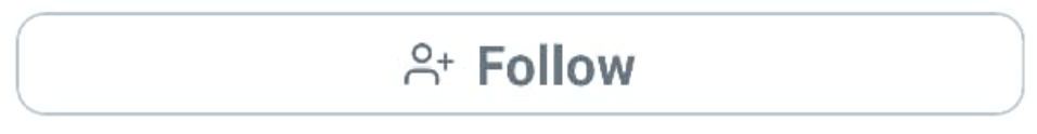
When you don’t follow someone, the button is white (not colored).
-
When you do follow someone, the button becomes red (colored).
Even though the label (“Follow” / “Following”) is technically correct, the visual feedback works opposite to what users are generally familiar with.
In most interfaces, a colored button signals an action that can be taken – not a passive state. So a colored “Following” button looks like a call-to-action (as if I should click it), while the uncolored “Follow” button feels visually secondary, even though that is the actual action users can take.
This creates a small, but repeating moment of confusion.
My suggestion:
Reverse the color logic:
-
“Follow” → colored button (e.g., red), because it is the primary action.
-
“Following” → uncolored / neutral button, because it represents a completed state.
This would align the component with common UI patterns and make the interaction more intuitive at first glance.
Thanks for considering!