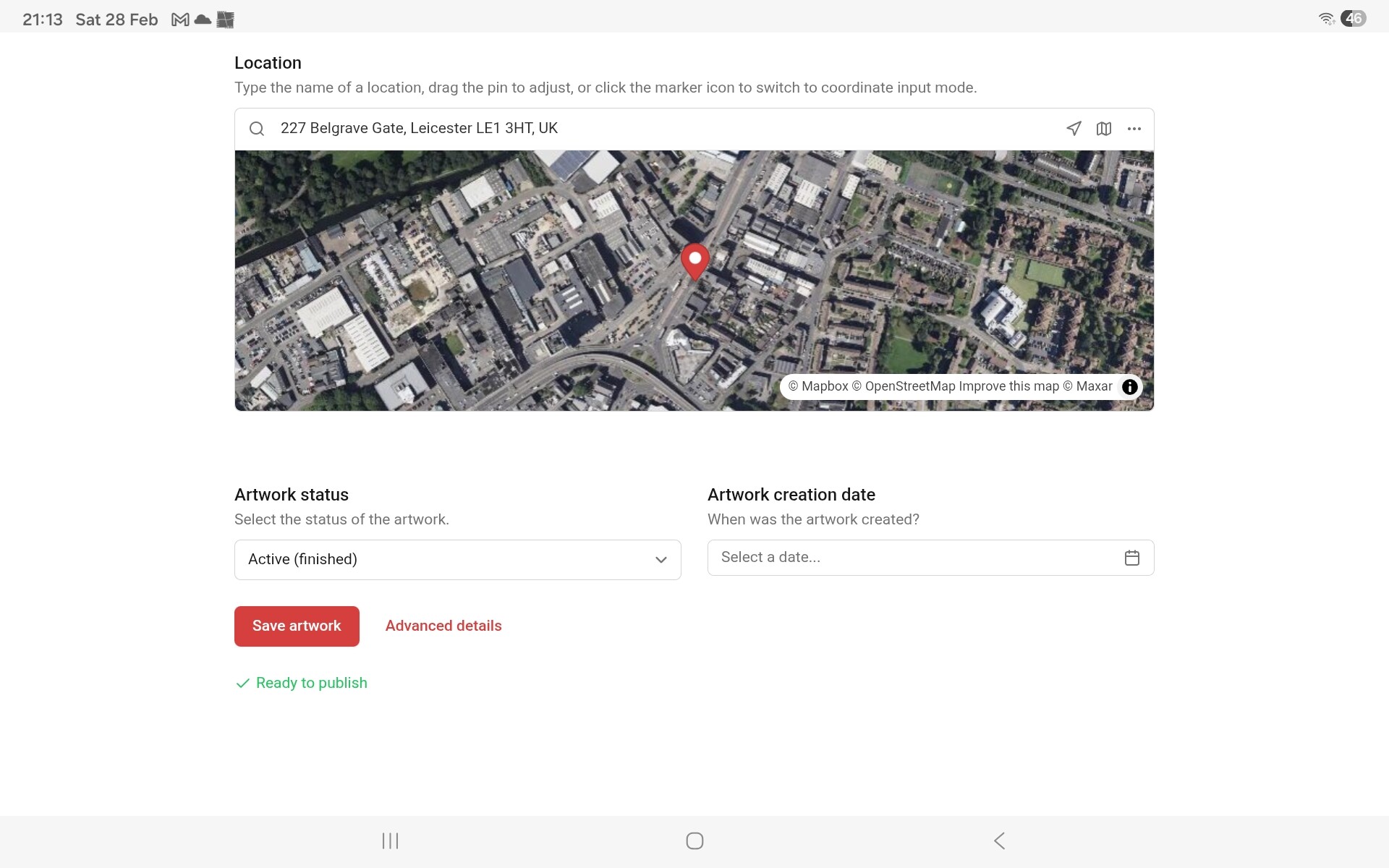
So, the very first time I used the advanced details, I had no idea that anything would be uploaded, because the only button available for closing that window was the X, a button usually used for closing without saving. Couple that with nothing visible on the editing Artwork page, I had to trust that it was going to appear.
Is there any way the UI can be adjusted to give novice users the confidence that the advanced detail markers will upload? Also, having something on the main edit page to indicate the advanced details page isn’t empty will be helpful for future hunters editing the page.
There is another UI issue, but as that’s related to use on a mobile rather than my tablet (which I’m currently on), I’m going to switch devices to show the screenshots.
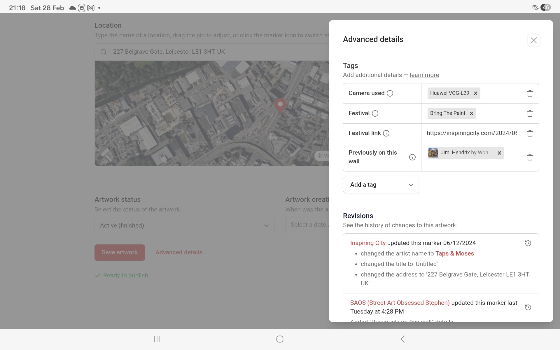
On my mobile now, which is what I nearly always use for uploading to SAC. This morning, I was adding this new artwork. As one of the artworks was only available during opening hours, I went to Advanced details, to add the appropriate marker.
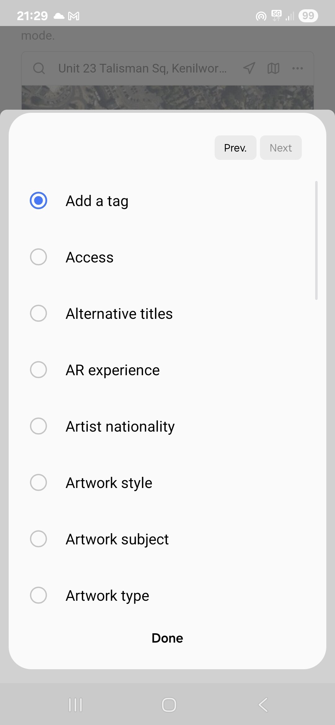
So, when you select any of the tags, the circle fills for a fraction of a second, then goes blank; Add A Tag gets the filled circle immediately afterwards. Because the drop down box fills the entire screen, you can’t see that the selection was made. It’s only after clicking “Done” that you can see that it has been added.
In both cases, everything still works, and if no UI changes gets made, things will continue to work.
However, the UI isn’t operating the way you would expect it to work, based on how similar layouts on other programs and apps work, and as such, it can be a problem for new users (well, it caught me out).
Think of it like a pull handle on a push only door. Sure, the door will still open, but you will catch out a lot of people who have never opened that door before.
Good points! Tags have become more important than they once were, so I would generally like to consider moving them out of that menu, but would like to do that as part of a bigger overhaul of the artwork editor.
Will definitely take in this feedback as part of that, but think it might take a while before we have time to properly work on that.
I will try to put in a little fix about your second message - I think I know why that is happening.